Introduction
Most organizations already have dashboards. The problem is that most of those dashboards were built around what a BI tool could easily display — not what a specific decision-maker actually needs to see at 9 AM on a Monday morning.
The result is familiar: a finance director pulling a custom spreadsheet because the dashboard doesn't break revenue down by the right segment. A marketing team and a sales team using different definitions of "conversion." An ops manager ignoring the dashboard entirely and asking an analyst for the numbers instead.
Bespoke dashboard development closes that gap. The distinction matters: this isn't a slightly more customized Tableau template or a white-labeled report. It's a purpose-built data product designed around your specific workflows, KPIs, data sources, and the people who actually make decisions.
According to Deloitte research, 67% of senior managers and executives are not comfortable accessing or using data from their current tools. It's a figure that explains why off-the-shelf BI adoption stalls — and why more organizations are commissioning dashboards built specifically for how their teams work.
What follows is a practical breakdown: what bespoke development actually involves, where it outperforms standard BI tools, and how to determine whether it's the right move for your organization.
Key Takeaways
- Bespoke dashboard development means building a data dashboard from scratch, designed entirely around your specific business needs
- Discovery and data architecture must come before any design work — skipping this step is the leading cause of project failure
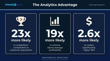
- Intensive analytics users are 23 times more likely to outperform competitors in customer acquisition
- Common pitfalls (vague objectives, data quality gaps, low adoption) are preventable with a structured build process
- The right partner brings data engineering, QA, and visualization expertise together, not just design skills
What Sets Bespoke Dashboard Development Apart
The word "custom" gets applied loosely in the dashboard world. In practice, three meaningfully different categories exist:
| Type | What it means | Best For |
|---|---|---|
| Off-the-shelf BI tools | Pre-built templates, limited to built-in connectors and metrics | Speed and cost |
| Generic custom dashboards | Custom-built but following a standard approach regardless of your workflow | Some flexibility |
| Bespoke development | Starts with understanding your goals, data, and people before any design begins | Precision and fit |
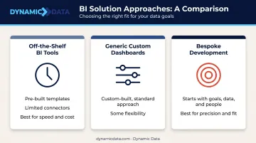
The defining characteristic of bespoke work is what happens before any chart is drawn. Discovery comes first: a structured process that maps the specific decisions being made, who makes them, what data exists to support them, and where that data lives. Only then does design begin.
Who Actually Needs Bespoke Development
Not every organization needs to go bespoke. Off-the-shelf tools work well enough when your data is simple, your workflows are standard, and speed to deployment matters more than accuracy of fit.
Bespoke development delivers disproportionate value when:
- Your data model is proprietary or doesn't match standard BI assumptions
- You operate in a regulated industry with specific compliance requirements
- Different teams are currently working from conflicting versions of the same data
- The decisions your dashboard needs to support are specific enough that generic metrics create noise rather than clarity
Seagate's Rethink Data report found that only 32% of enterprise data is actually put to work, with 39% of organizations citing the challenge of making collected data usable. Off-the-shelf tools rarely solve that problem — they display data, but they don't make it usable for specific decisions.
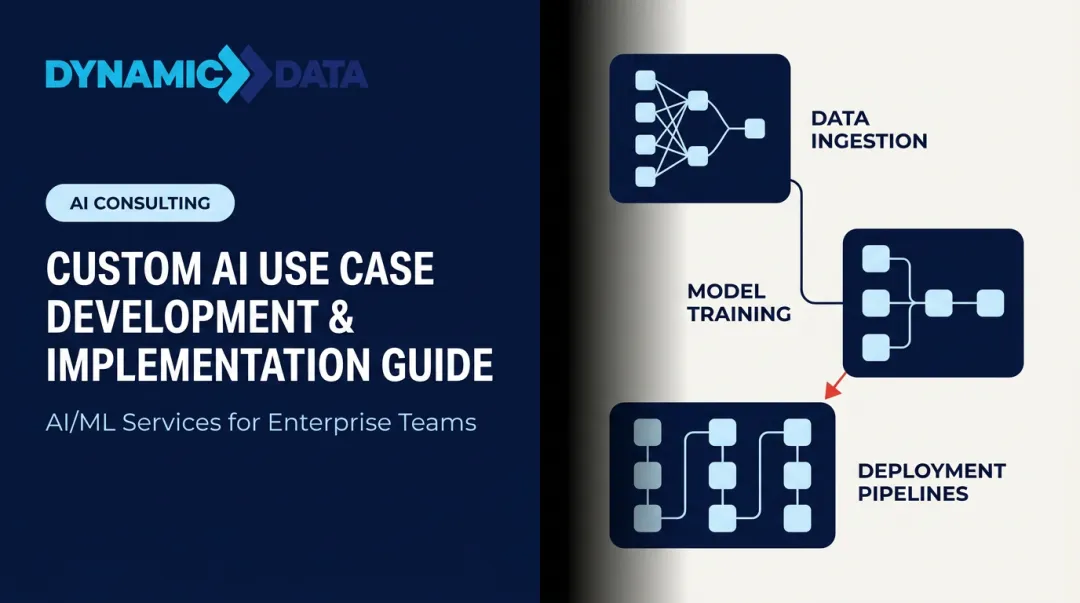
The Bespoke Dashboard Development Process
Discovery and Requirements Gathering
Every bespoke engagement starts here, and the depth of this phase determines whether the dashboard will actually get used.
Structured stakeholder interviews ask specific questions: What decision does this dashboard need to support? Who makes it? How often? What do they look at now, and what's missing? A data audit runs alongside this, cataloguing available sources, identifying quality issues, and flagging inconsistencies before they become dashboard problems.
The outputs of discovery are concrete:
- A documented KPI framework linking each metric to a specific decision and decision-maker
- A data source inventory with quality assessment
- A defined primary persona — the person the dashboard is primarily designed for
- Identified data gaps that need to be resolved before build begins
Harvard Business Review research found that up to 85% of big data projects fail — and the most common cause is entering execution before the problem is properly defined. A rigorous discovery phase is the most effective risk mitigation available.
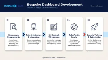
Data Architecture and Integration Design
Once the KPI framework is established, the data team designs the pipeline: which sources to connect, how to normalize data across those sources, what refresh cadence fits the use case (real-time vs. scheduled batch), and how to validate accuracy before any visualization work begins.
This phase answers the question most clients don't think to ask until it's too late: can our data actually support the dashboard we want to build?
Data architecture decisions made here directly determine what the dashboard can reliably show. IBM reports that more than 25% of organizations lose over $5 million annually from poor data quality — problems that a well-designed data layer catches before they reach the dashboard.
UX Design and Visualization Planning
Once the data layer is confirmed, design begins — and the starting point is information hierarchy, not aesthetics. Which KPIs belong on the primary screen? Which chart type fits each metric and user task? How does the layout support the primary persona's actual workflow?
Wireframes go to stakeholders for approval before any development starts. This prevents the expensive cycle of building something, showing it to users, and rebuilding it based on feedback that could have been gathered in a two-hour review session.
Build, Test, and Iterate
Development follows the approved design. QA runs alongside it — not just technical review, but user acceptance testing with real end-users under live data conditions.
A dashboard can pass technical review and still fail when actual users encounter it with actual data. Testing with the primary persona catches usability problems, data accuracy issues under real-world conditions, and edge cases that only surface when the data is live.
Launch, Training, and Ongoing Optimization
Launch is not the finish line. User onboarding, clear documentation, and a defined maintenance schedule (pipeline monitoring, metric reviews, retiring outdated KPIs) keep the dashboard accurate and relevant as business priorities shift.
That means scheduled metric reviews, proactive pipeline monitoring, and a process for retiring KPIs that no longer reflect how the business operates. The engagement doesn't end at delivery — it evolves with the dashboard.
Key Features of a Well-Built Bespoke Dashboard
Tailored KPI Frameworks
Generic dashboards display business metrics. Bespoke dashboards define each metric in terms of the specific decision it drives for a specific role.
The practical implication: vanity metrics get removed. A metric that can't answer "what action changes based on this number?" doesn't belong on the primary screen.
Research on working memory from Cowan's peer-reviewed work suggests the brain processes roughly three to five chunks of information at once. That finding reinforces Stephen Few's dashboard design principle: limit the primary view to critical metrics that fit on a single screen — fewer, better metrics consistently outperform comprehensive collections.
Seamless Multi-Source Data Integration
Bespoke dashboards connect the exact data sources a business uses — not a generic pre-built selection. Common integrations include:
- CRMs and ERPs for operational and sales data
- Marketing platforms and third-party APIs for campaign performance
- Financial systems and cloud data warehouses for a single normalized view
The result: numbers that are attribution-ready and deduplicated before decision-makers ever see them. No more reconciling why marketing's revenue figure differs from finance's. That data integrity sets the foundation for the next layer of a well-built dashboard: controlled access.
Role-Based Access Control and Compliance Architecture
Security and compliance aren't add-ons in a bespoke build — they're designed into the data layer from the start. This includes:
- Granular viewing and editing permissions by role
- Audit trails for sensitive data access
- GDPR and CCPA compliance built into data handling, not bolted on after
NIST SP 800-53 establishes access control as a foundational security control — and for organizations in regulated industries, designing this into the dashboard architecture from day one is far simpler than retrofitting compliance later.
Business Benefits of Bespoke Dashboards
Faster, More Confident Decisions
When a dashboard shows only what a decision-maker needs — with goals, prior-period comparisons, and trend context — the gap between opening the dashboard and taking action narrows considerably.
McKinsey research found that intensive users of customer analytics were 23 times more likely to clearly outperform competitors in new customer acquisition, 19 times more likely to achieve above-average profitability, and 2.6 times more likely to realize significantly higher ROI than organizations using analytics sporadically. A bespoke dashboard is how intensive analytics use scales across an organization.
A Single Source of Truth
When different teams pull from different tools, version-control problems follow. Marketing's pipeline number doesn't match sales', finance's revenue differs from ops', and leadership ends up reconciling figures in meetings instead of acting on them.
Bespoke dashboards consolidate all relevant sources into one validated view, with consistent metric definitions agreed on during discovery. Cross-functional alignment becomes a natural byproduct of the architecture — built in from the start, not negotiated meeting by meeting.
Scalability Without Rebuilding
Off-the-shelf tools hit real limits as data volume and business complexity grow. Adding a new data source means workarounds. New user roles mean permissions hacks. New KPIs require reworking the entire layout.
Bespoke dashboards built on a scalable architecture absorb these changes cleanly. New sources, additional users, and evolved processes get incorporated without a full rebuild — because the foundation was designed with growth in mind. Specifically, that means:
- Adding data sources without ETL workarounds
- Expanding user access without permissions hacks
- Introducing new KPIs without overhauling the layout
Measurable ROI
That scalability compounds financially. A Forrester Consulting study on BI tool implementation documented 127% ROI and an 87.5% reduction in report creation time for customers with well-implemented analytics.
Manual reporting time freed up means analysts and managers working on higher-value problems instead of pulling data. Faster responses to market shifts mean less time between spotting an opportunity and acting on it.
Common Challenges in Bespoke Dashboard Development
Vague Objectives at Project Start
The most preventable failure mode in dashboard projects is entering design before stakeholders agree on what specific decisions the dashboard will drive. Without that clarity, every metric becomes a candidate and the dashboard ends up showing everything — which means decision-makers ignore it.
A structured discovery phase solves this. Apply a "decision test" to every proposed metric: what specific action changes based on this number? Metrics that can't answer that question don't make the cut.
Data Quality and Integration Complexity
Bespoke dashboards surface data quality problems that existed before but were invisible. Missing fields, inconsistent naming conventions, schema changes from source systems — these problems don't disappear when you build a dashboard; they show up as numbers that don't add up and erode trust in the tool.
Addressing this requires data engineering expertise applied before the visualization layer is built. IBM data shows 43% of chief operations officers identify data quality as their most significant data priority — and for good reason. Skip this phase, and two contradictory numbers on the same leadership review screen will do more damage to data trust than any technical failure.

User Adoption and Change Management
A technically excellent dashboard fails if users don't trust it, understand it, or incorporate it into their workflow. IBM, citing Gartner, reports that only 29% of employees actively use analytics and BI tools on average — a figure largely unchanged over seven years.
Closing that gap requires deliberate effort at every stage:
- Design for real users from the start, not assumed personas
- Involve end users in testing before launch
- Provide clear onboarding tied to actual workflows
- Build a feedback loop so the dashboard evolves with usage
How Dynamic Data Builds Bespoke Dashboards
Dynamic Data's approach to bespoke dashboard development starts where the outline above suggests it should: with discovery. Before any design or development begins, the team maps each client's data environment, decision workflows, and KPI requirements — the same consultation-first model that separates genuinely bespoke work from off-the-shelf templates dressed up as custom work.
The team brings specific technical depth to each engagement:
- dbt-certified data engineering for reliable, testable, version-controlled pipelines — the foundation that keeps dashboard data accurate as source systems change
- ISTQB-certified QA for data accuracy validation before launch, not just technical review
- Expertise across 35+ platforms and languages, enabling integration with virtually any combination of data sources a client uses
Dynamic Data's engagements span solar energy, IoT, real estate, healthcare, manufacturing, and SaaS — each with distinct data architecture challenges. For Pima Solar, the team connected three previously siloed platforms (CallFire, Go High Level, and JobNimbus) to give leadership full visibility into the marketing-to-sale journey for the first time. For Zenus, they built a real-time data infrastructure on Google Cloud with automated dbt pipelines, transforming a static prototype into a live, scalable client-facing dashboard.
Those same engagements often extend into predictive territory. Dynamic Data integrates AI and machine learning capabilities directly into dashboard builds — predictive analytics, anomaly detection, and recommendation engines — so clients can act on what's likely to happen, not just report on what already did.
Every engagement starts with a conversation about your data environment — before any platform is recommended or any build begins.
Frequently Asked Questions
What is the difference between a bespoke dashboard and an off-the-shelf BI tool?
Off-the-shelf tools offer pre-built templates and generic metrics designed to work for a broad market. A bespoke dashboard is designed entirely around your specific data sources, KPIs, decision-makers, and workflows, showing only what's relevant to your business.
How long does bespoke dashboard development typically take?
Timelines vary based on data complexity, number of integrations, and compliance requirements. The discovery and data architecture phase is the most critical investment, and rushing it is the most common reason projects run over schedule.
What data sources can a bespoke dashboard connect to?
Bespoke dashboards can connect virtually any data source — CRMs, ERPs, marketing platforms, financial systems, cloud data warehouses, and third-party APIs. The integration design is specific to each client and determined during the discovery and architecture phase.
How much does bespoke dashboard development cost?
Cost depends on the number of data sources, complexity of the data model, number of users, and features like real-time refresh or AI-driven insights. The more useful comparison is total value delivered: reduced manual reporting, faster decisions, and eliminated data errors against the build investment.
Can a bespoke dashboard be updated or scaled as the business grows?
Bespoke dashboards built on a well-designed data architecture can add new sources, KPIs, and user roles without rebuilding from scratch. Quarterly metric reviews and a defined maintenance schedule keep the dashboard aligned with how the business actually operates.
What industries benefit most from bespoke dashboard development?
Any industry combining data from multiple sources benefits, but bespoke development is particularly valuable in sectors with complex data models, compliance requirements, or proprietary workflows — including finance, healthcare, SaaS, e-commerce, solar and energy, and IoT — where generic tools cannot accurately reflect unique operating metrics.