

Which map should you use in Data Studio? A guide to the seven map types.
Data Studio (formerly Looker Studio) gives you seven ways to put data on a map, and they answer different questions. A filled map tells you how regions compare. A bubble map tells you where volume is concentrated. A heatmap tells you where density is highest, which is not the same thing. Pick the wrong one and the map looks fine but says nothing.
We built a portfolio of all seven, plus two full dashboards that put maps in context, so you can see the difference side by side. Here’s what each map does, when to use it, and what your data needs to look like.
What types of geospatial data are available in Data Studio?
To make your maps work flawlessly, Data Studio needs to understand your location data. While it is smart enough to recognize standard names, formatting your data correctly is the best way to prevent missing locations.
Here are the supported geographic formats and the best practices for writing them:
- Continent: The most expansive geographic category available. Example: Africa
- Subcontinent: Identifies specific clusters located within larger continental masses. Example: North America
- Country: Recognizes standard, globally accepted nation-state designations. Example: Canada
- Country Subdivision (Primary): Covers states or provinces. Including the country name helps the tool avoid mapping errors. Example: Arizona, USA
- Country Subdivision (Secondary): Represents counties or local departments. Always pair this with the state to ensure the data maps correctly. Example: Navajo County, Arizona
- Designated Market Area (DMA): Specialized media markets utilized for regional campaign targeting within major advertising and analytics platforms. Example: 501
- City: Defines specific urban centers. To differentiate between cities with identical names, always include the state or country. Example: Springfield, Illinois, USA
- Postal Code: Zip codes and international variations. Adding the country name provides the highest level of geographic certainty. Example: 90210, USA
- Address: Pinpoints street-level positions. For best results, format the string starting with the most specific detail through to the country. Example: 1600 Amphitheatre Parkway, Mountain View, USA
- Latitude, Longitude: Provides precise GPS coordinates, formatted as two numbers separated by a single comma. Example: 51.4700, -0.4543
- Geospatial (BigQuery): Advanced data structures like LINESTRINGs that define paths. Example: LINESTRING (-114.3332 32.6598, -114.3328 32.6600, ...)
The short answer: which map for which question
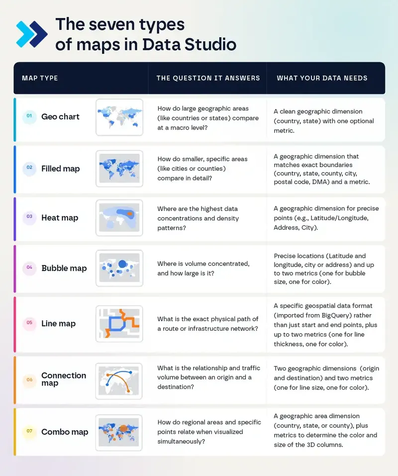
Geo chart: How does performance vary by country or state?
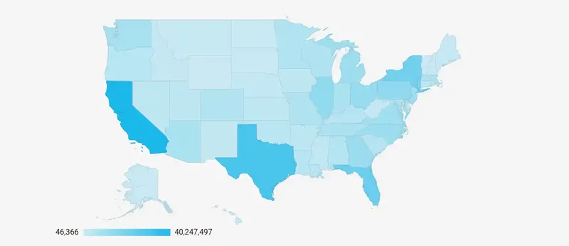
[Explore this map live in our Data Studio portfolio]
The geo chart provides a basic, high-level overview. It colors countries or states based on a single metric and is the fastest way to answer "where we're strong and where we're weak" at a glance. It was the first map Data Studio offered.
Use it when you’re presenting results at the executive level and the answer is a country or state. It loads incredibly fast, uses very few resources, and is instantly understandable without explanation.
Skip it when the audience needs to zoom in. This map generates a static image, so it doesn't allow navigation down to street level.
What your data needs: a clean geographic dimension (like country or state).
Filled map: How do specific areas compare in detail?
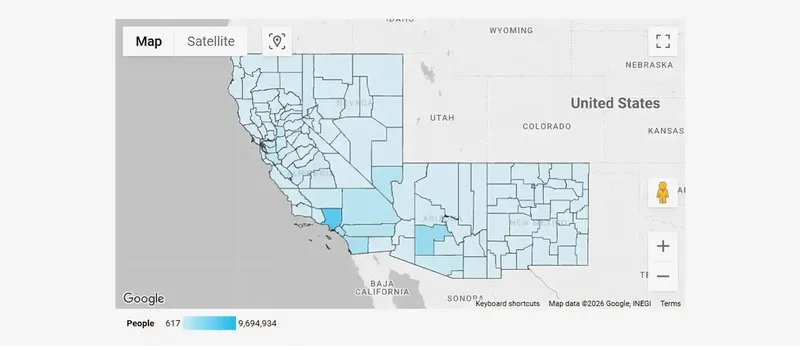
[Explore this map live in our Data Studio portfolio]
A filled map shades geographic boundaries by intensity, so the comparison between regions is the whole point. Darker means more. It’s the right chart when the boundary itself is the unit of analysis: sales by state, delivery times by postal code, coverage by county.
Use it when comparing metrics across defined geographic areas such as counties, states, or cities.
Skip it when the areas you want to display are too small. While it displays excellent detail, it works for cities but not for neighborhoods.
What your data needs: a geographic dimension that can be linked to exact boundaries (country, region, state, city, or postal code).
Heat map: Where is activity densest?
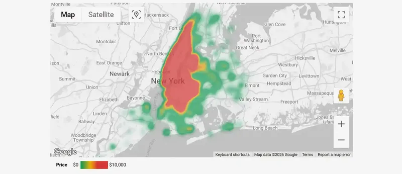
[Explore this map live in our Data Studio portfolio]
A heat map represents the magnitude or density of data points using colors. It blends nearby points into a continuous gradient, simplifying complex information into clear areas. This allows patterns to emerge that individual markers hide, revealing density patterns and hidden clusters of demand, hotspots of activity, or gaps in coverage.
Use it when you have a large volume of points and want to provide an immediate visual understanding of concentration levels. It allows you to quickly visualize concentrations and identify hotspots across large datasets, such as areas with the highest sales, traffic, or incident density.
Skip it when you need to read specific values. A heat map gives you intensity, not numbers, so it belongs next to a chart that gives the reader the figure.
What your data needs: a geographic dimension for precise points (such as latitude and longitude, exact addresses, or cities) per event or record. Volume is what makes this chart work; with 50 points, use a bubble map instead.
Bubble map: Where is volume concentrated, and how large is it?
[Explore this map live in our Data Studio portfolio]
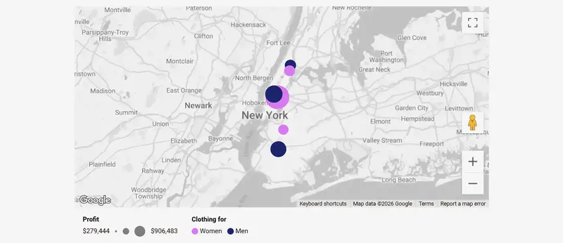
A bubble map visualizes magnitude and distribution at specific locations using proportional circles. It places a circle at each point and scales it by a metric, so size carries the value.
Use it when you need to compare metrics in specific, precise locations. It's ideal for analyzing the performance of physical stores (such as revenue per branch), units shipped per warehouse, or visualizing the number of active app users per city worldwide.
Skip it when your points are tightly clustered. Overlapping bubbles in a dense metro area become unreadable, and that’s usually the moment to switch to a heat map.
What your data needs: Precise geographic locations (such as latitude and longitude, city names, or addresses) and a metric to determine the bubble size. You can also add a second metric to define the bubble color, or a dimension to color the bubbles by category. Unlike a heat map, this chart works perfectly well even if you only have a few data points to display.
Line map: What is the exact physical path of a route?
[Explore this map live in our Data Studio portfolio]
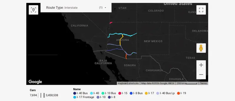
A line map visualizes exact physical routes, infrastructure networks, and real-world geographic paths. Unlike a connection map that simply draws a straight line between two points, a line map offers absolute precision by tracing the exact geographic shape of a route, following existing roads or boundaries.
Use it when you are analyzing physical networks and infrastructure. Common examples include tracking the exact route, street by street, of a delivery truck, or visualizing vehicle traffic volume across interstate, state, and U.S. routes.
Skip it when you only know where a journey started and ended. If you just want to show relationships between cities or countries without caring about the exact highway taken, use a connection map instead.
What your data needs: You cannot plot this route with just the start and end points; you need a specific data format called geospatial (like LINESTRING) that typically comes from BigQuery. Additionally, you will need a color dimension to categorize the lines (e.g., route type) and a thickness metric to represent volume (e.g., number of cars).
Connection map: How does movement flow between two points?
[Explore this map live in our Data Studio portfolio]
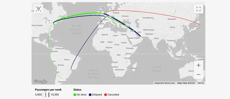
A connection map visualizes point-to-point relationships, network flows, and magnitude across geographic locations. It connects an origin to a destination, which makes it perfect for showing relationships rather than exact locations. The line's thickness and color represent the type and amount of traffic.
Use it when the insight is in the connection at a global scale, where the exact path is irrelevant. It provides instant clarity in origin-destination relationships, making it ideal for international flight routes, global import/export trade, customer migration, or visualizing digital traffic between global data centers.
Skip it when you are missing either the origin or the destination. Without both a start and an end point, there’s no line to draw. Also, skip it if you need to track the exact street-by-street path of a vehicle, that is when you switch to a line map.
What your data needs: Geographic location of both ends of each flow, such as the latitude and longitude of origin and destination (or the city name). A metric is also needed to determine the thickness (volume) of the line and a dimension to define its color (category or status).
Combo map: How can you visualize two different metrics for the same region simultaneously?
[Explore this map live in our Data Studio portfolio]
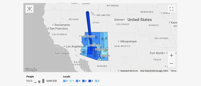
A combo map combines multiple geographic layers to visualize a regional filled area and a 3D column representing a secondary metric at the same time. It facilitates complex visualizations by offering a 3D column chart right on top of a specific region, such as a country, state, or county.
Use it when you need to overlay a broad regional metric with a secondary metric for that exact same area. It's ideal for scenarios like overlaying total state revenue (using filled areas) alongside the total number of stores in that state (using 3D columns).
Skip it when you need to display multiple distinct points (like several individual physical locations) within the exact same boundary. The tool has a strict limitation: only one column can be plotted per area.
What your data needs: A geographic area dimension (like country, state, or county) for the base map, plus metrics to determine the color of the filled area and the size of the 3D columns.
A map on its own doesn’t answer a business question
A map tells you where, it rarely tells you why, and it never tells you what to do next. That comes from putting the map next to the rest of the picture, the KPI cards, the trend line, the ranking, the filters.
Once a map sits in a full dashboard, it changes function. You stop looking at it and start using it: click a region, and every other chart on the page filters to that region. The map becomes the control, not the illustration.
We built two dashboards to show what that looks like:
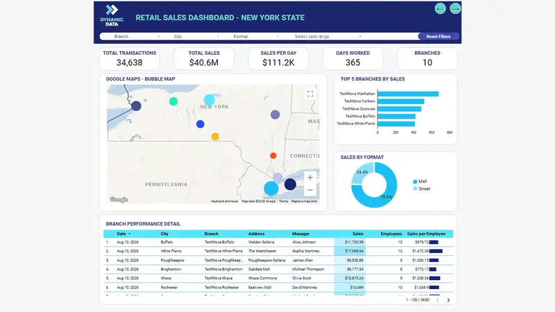
Retail dashboard: sales by branch across New York
[Explore the live retail dashboard]
A bubble map of branch revenue, paired with revenue KPIs, a breakdown by store format, and a performance ranking by city and salesperson. The map answers “where is revenue concentrated”; the ranking next to it answers “and who is driving it”.
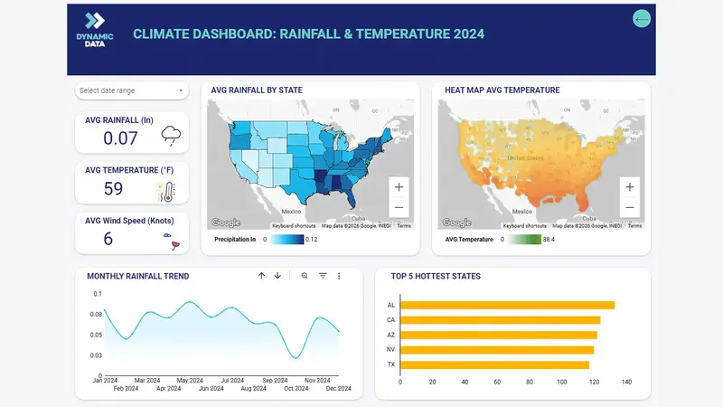
Climate dashboard: rainfall and temperature monitoring
[Explore the live climate dashboard]
A side-by-side geographic analysis featuring a filled map for state-level rainfall and a heatmap for temperature concentration. These maps are supported by high-level KPI cards (average rainfall, temperature, and wind speed), a monthly rainfall trend area chart, and a ranking of the top 5 hottest states. The maps instantly show where extreme conditions exist, while the trend line and ranking provide the necessary historical context to understand the broader climate patterns.
Frequently asked questions
Do I need latitude and longitude to build a map in Data Studio?
Not for all of them. Geo charts and filled maps work from a geographic dimension like country, state, or city. Bubble maps and heat maps need actual coordinates, while line maps require specific geospatial data formats (like BigQuery LINESTRINGs).
Why are some of my locations missing from the map?
Almost always inconsistent geographic values. “NY”, “N.Y.”, and “New York” are three different strings, and anything Data Studio can’t match gets dropped without an error. Standardizing the geographic field is usually the fix.
What’s the difference between a heat map and a bubble map?
A bubble map compares magnitude at specific points; each bubble is a value you can read. A heat map shows density across an area; it tells you where things cluster but not how many.
Can a map filter the rest of my dashboard?
Yes. Set the map as a filter control, and clicking a region or point filters every other chart on the page. This is what turns a map from a picture into a navigation tool.
How much data do I need before a map is useful?
Enough variation to see a pattern. Five locations don’t need a map; a table is clearer. Maps earn their space when the geography itself carries information you’d otherwise miss.
Want a dashboard like this for your business?
These seven maps are powerful tools, but they are only as good as the data feeding them. The real secret to a successful dashboard is what happens before you build it: standardizing your locations and ensuring your numbers are accurate and consistent.
If you’d like a dashboard built around the questions that actually matter to your team, let’s talk. Happy to walk you through how we’d approach it.
Written by Franco Pruzzo
Data Analyst at Dynamic Data