

We tested dbt Charts: our first look at dashboards built inside your dbt project
Your dbt models define revenue one way. Then someone rebuilds that logic in a BI tool, a filter gets applied slightly differently, and two dashboards show two different numbers for the same month. Most analytics teams have lived some version of this.
dbt Charts is dbt Labs’ answer: a way to build dashboards without leaving your dbt project. Instead of rebuilding your models’ logic in a separate BI tool, you describe the dashboard in a YAML file that queries your dbt models directly. It’s in public beta, so we ran a proof of concept to see how it holds up in practice. Below, we cover what it is, how it works, and our first impressions: what it does well and where it still falls short.
What dbt Charts is and how it works
Where it lives: next to dbt, not inside it
dbt Charts isn’t a feature you switch on inside dbt Core or the dbt platform (formerly dbt Cloud). It’s a separate, open-source tool: the engine, the dct CLI, and the YAML language are all free, released under the Apache 2.0 license. It works alongside any dbt project (and dbt itself is optional; it can also run on plain SQL). It plugs into two things you already have:
- Your dbt credentials. If you have a profiles.yml, dbt Charts reuses it. If your project runs in the dbt platform and you don’t keep one locally, you can point it straight at your warehouse instead.
- Your editor. VS Code and Cursor get a dbt Charts extension with syntax highlighting, snippets, and a live preview.
A dashboard is a YAML file in your repo
After setup, your project has a dbt_charts.yml file at the root and a charts/ folder next to your models. Every dashboard is a YAML file in that folder. The docs call each one a “board,” and it defines the board’s queries, charts, variables (the filters), and layout.
To resolve {{ ref() }} and {{ source() }}, dbt Charts reads your project’s target/manifest.json. That means you run dbt parse or a build first: dbt Charts never runs dbt build itself. And because every board is a file in your repo, every change is a commit. Boards go through the same pull requests and the same history as the rest of your project.
Everything is SQL, and it runs on your warehouse
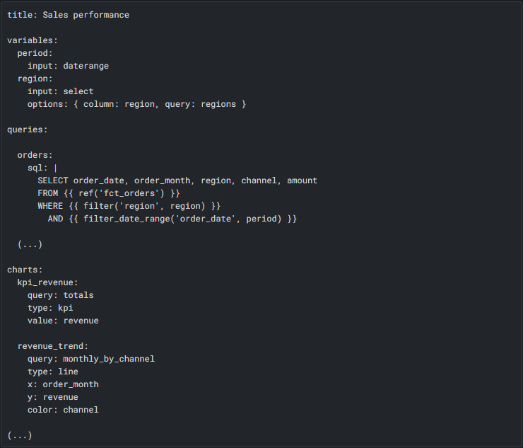
Each chart reads from a query, and each query is SQL against your database. The chart itself doesn’t calculate anything. As the docs put it, “the renderer never sums for you”: aggregations, totals, trend lines, and date buckets all go in the SQL.
Locally, you can query any of 13 databases, plus CSV, Parquet, or JSON files. dbt Charts Cloud connects to four: Postgres, Redshift, Snowflake, and BigQuery.
dbt Charts also tries not to hit your warehouse more than it needs to. Every query has a name, and a named query runs once, even when several charts use it.
Results are cached, too. While dct serve is running, it keeps each query’s result in memory, so reopening or reloading the dashboard doesn’t query the warehouse again. That cache disappears when the server stops, unless you save it to a DuckDB cache file on disk, which keeps results across restarts. You can also set a TTL (time to live): how long a saved result stays valid before the query runs again.
The trade-off is freshness. What someone sees is the result of the last query, not necessarily the latest data, and each board shows when that was with a “Data as of” timestamp. To get new data locally, you restart the server, run it without the cache, or let the TTL expire. In dbt Charts Cloud, someone with the right permission clicks refresh on the dashboard; there’s no built-in schedule.
Our proof of concept
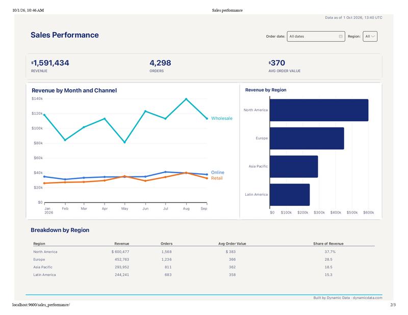
We built a sales dashboard on top of a single fct_orders model. It has three KPIs (revenue, orders, and average order value), a monthly revenue trend by channel, a bar chart of revenue by region, and a region breakdown table. There are two filters: a date range and a region. The full file is 124 lines; here’s the core of it.
What you can build, and how it looks
The chart types cover most business dashboards: line, bar, area, scatter, pie, donut, heatmap, histogram, table, KPI, and callout, plus three kinds of maps. You can also combine bars and a line on two axes, repeat a chart as small multiples, and build pivot tables. Layout is written in YAML as rows, columns, a grid, or tabs, and column layouts stack on phones.
For the look, there are five built-in themes: clarity (the default), paper, vivid, neon (a dark theme), and stark. A brand theme is a small file that extends one of them and changes only what you name. Set it in charts/meta.yml, and every board in the project uses it. Shared pieces, like a header or a KPI row, can live in a partial file that several boards reuse.
How people use it and share it
While you build, the VS Code extension re-renders the board with real data as you type. The person reading the dashboard opens it in the browser, served by dct serve. From there, they can use the filters, set them from the URL, or click a bar to filter the rest of the page.
To share it, you have two options:
- Export a file. A board exports as PNG, PDF, SVG, or HTML.
- Publish it in dbt Charts Cloud. This is an optional hosted product, separate from the dbt platform, with its own sign-up. It serves the same YAML you preview locally. You connect a GitHub repository and invite people by email. Access is set by role and by the folder a dashboard lives in. Instead of each person using their own credentials, an admin sets up one warehouse connection for the whole organization.
dbt Charts is also built with AI assistants in mind, through an MCP connection and a Cloud connector. We cover that in the advantages below.
Advantages: it builds on everything dbt already gives you
A visualization tool for the people who already write SQL. dbt users don’t have to learn a new formula language or a separate BI tool. Each chart is a query they could have written anyway. The entry bar is low, too: dbt Labs lists a basic grasp of your data models, basic YAML, and basic git as all you need.
Full control over the calculations. Because every number comes from your SQL on your models, you decide exactly how a metric is computed. That’s a level of control drag-and-drop tools don’t always give you.
Easy to read, easy to change. In dbt Labs’ words, “YAML is the source of truth”: dashboards are text files that are “version-controlled, diffable, reviewable in a pull request.” Anyone on the team can see how a board was built, and changing it is a text edit.
Governed and versioned like your models. Boards live in git, so their history is your commit history. In dbt Charts Cloud, every save becomes a commit, and you can require a review before a change goes live.
Dashboards that move with your models. Because boards sit next to your models, when your models change on a branch, the dashboards on that branch change with them. That means “no dangling references to fix after a migration.”
Broken dashboards get caught before merge. dct validate checks every board against the dbt manifest, which flags renamed models and missing columns. dct impact lists the boards that read a column before you change it (with one caveat we cover under limitations), and dct init ci sets up a GitHub Actions check.
Built to work with AI. dbt Labs argues that YAML is “far easier for an AI assistant to write correctly than JavaScript, a proprietary BI config, or hand-drawn SQL.” In practice, you can ask Claude Code, Codex, or Cursor to install the tool and build boards from your data, then request changes in plain language. Every change the assistant makes is still a YAML diff you can review. dct init mcp connects dbt Charts to Cursor, Claude Code, or ChatGPT, and dbt Charts Cloud adds a read-only connector for Claude and ChatGPT that respects your existing permissions.
Permissions that follow the repo. In dbt Charts Cloud, who can see a dashboard depends on the folder it lives in, just like a file system. Cloud only reads from your warehouse, so dbt Labs recommends connecting it with a read-only user.
Limitations: what to consider before adopting it
Sharing is the weak spot. Locally, dct serve has no access control, so anyone who can reach it sees everything. Exports have their own problem: in our view, once a board is a PDF or an image, it’s out of your hands, and no permission follows it. In our test, the HTML export kept its tooltips, but the filters were only drawn on the page and didn’t work.
Cloud has its own account and its own limits. The people you share with need a dbt Charts Cloud invitation, or you have to make the dashboard public. Making it public isn’t a single toggle: it takes an organization switch, a project switch, and a public grant on the dashboard’s folder. Cloud also works only with GitHub and supports four warehouses.
It doesn’t reuse the Semantic Layer. Querying metrics from the dbt Semantic Layer is planned, but it isn’t available yet. Until it is, metrics end up defined in two places. The open GitHub issue says so itself: teams “restate those metrics as SQL in every board, which duplicates the definition and lets the two drift.”
Invisible to dbt’s lineage. A board isn’t a dbt resource, and dbt Charts never touches your dbt commands, so dbt doesn’t know the board exists. As far as we could tell, boards don’t show up in the dbt DAG or in dbt docs, and the dbt Charts docs don’t mention exposures. To see which models a chart uses, you read its YAML.
dct impact covers the other direction (which boards read a given column), but it can’t analyze a query with a template expression where a column or table name would go, like WHERE {{ filter('region', region) }}. Instead, it lists those boards separately for you to check by hand. In our test, that was every query in the dashboard, since they all use a filter or build on another query.
The flip side of SQL. There’s no drag-and-drop editor, and every calculation has to be written in SQL first. That leaves out business users who want to build their own reports.
Exploring is awkward. The editor preview is a static render; in the docs’ words, “its variable pills are a picture of the controls, not the controls.” The filters only work once you open the board in the browser. That’s great for checking results while you develop, but less useful for poking around the data.
Some design limits. You can’t add a new chart type yet, and raw HTML is capped in dbt Charts Cloud. In our test, the paper theme also turned our sentence-case titles into Title Case, which you can see in the screenshot above.
No scheduled delivery. Cloud refresh is manual, and scheduled email isn’t built in.
A dashboard is only as good as the models behind it
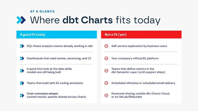
dbt Charts brings the discipline of analytics engineering to the dashboard itself. Because every board lives in git, it gets the same practices as your models: review, versioning, and CI. Implemented well, that’s better governance than a folder of AI-generated HTML dashboards, and you get it without a traditional BI tool. Metrics stay under control, too, because the query behind every number, and the models it reads from, are right there in the file. It’s cost-conscious by design, with cached results and queries shared across charts. And for developers, it’s a quick first look at the data while the models are still being built.
That said, we wouldn’t recommend it today as an exploration tool or as a company’s official BI platform. There’s no drag-and-drop for self-service analysis, and the design options are still limited. Two things would change our view: querying the Semantic Layer, so metrics aren’t defined twice (already planned), and showing boards in the dbt lineage next to the models they depend on.
In the end, the tool can only show what your models get right. If you’re weighing dbt Charts for your team, or want your dbt project ready for it, let’s talk. We’re happy to walk you through how we’d approach it.
Frequently asked questions
Is dbt Charts available now? Yes, as a public beta. dbt Labs announced it in the September 2026 dbt release notes.
Which dbt product is it part of? None directly. The engine, the dct CLI, and the YAML language are free and open source under the Apache 2.0 license. It works with dbt Core, dbt platform (formerly dbt Cloud) projects, or plain SQL, since dbt itself is optional. dbt Charts Cloud is a separate hosted product with its own sign-up.
How much does it cost? The open-source part is free. dbt Charts Cloud has a free Individual plan for up to three collaborators, with unlimited queries. Team pricing isn’t published yet; it will be per seat, with “never a meter on your warehouse bill.” The pricing page doesn’t say whether view-only users count as collaborators.
Where does it run? The dct CLI runs on your machine and serves boards locally. dbt Charts Cloud hosts them for your team from the same YAML. Either way, the queries themselves run on your database.
Written by Belén Rumie
Principal Consultant - Data Strategy & Platform